While trying to make decisions for what kinds of post I wanted to write for my blog, I thought, "What do I have to say that others would want to hear and see when they read a scrapbook blog?" The first thing that came to mind was something that I remember many people would ask about when they came to shop at the local store where I worked in Wichita. Getting ideas on how to lay out a scrapbook page was often at the top to their list of questions.
Because I love to have as many pictures on a page as possible, I generally try to do a two-page spread that includes pictures that are related in some way. They might be pictures of a special place my husband and I visited while on vacation. They might be shots of being with grandkids on a fabulous get-away. They could be pictures of friends at our wedding reception. Having your pictures organized before beginning helps tremendously.
Using a Color Theme
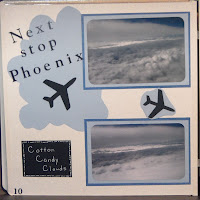
Sometimes those two-page spreads turn out to be several pages, so I try to make all the pages follow a certain theme as far as color. An example would be using a variety of shades of blue for pictures of clouds.

At one scrapbook crop as I worked on page upon page of cloud pictures, one friend said to me, “Do you still have your head in the clouds?” I loved working on those pages as I had not flown often enough at that point for the views from the sky to be “old hat.” Needless to say, there were lots of cloud pictures!
Vary Picture Size and Shape
Different shapes and sizes of photos on a scrapbook page can add some variety.
While working on one particular page in my Hawaii scrapbook, I realized I had left out a couple of pictures I wanted to include. Having already adhered some of the pictures to the page, I had to get creative in order to make room for the missing ones. Shrinking the pictures on my Kodak Zoom, a wonderful little compact photo printer, did the trick. I left the original matt and placed all three of the pictures I needed on it. No one would ever know that it wasn’t planned that way from the beginning.
Do You Like What You See?
However you decide to design your scrapbook pages, keep in mind that what really matters is whether you can look at the page for years to come and like what you see. Go with what feels and looks right to you. Others may agree with you or not. Your opinion is what you should go with. Advice from others can get you going when you have a “brain freeze,” but use your own best judgment when making the final decision. You are the one who will have to live with the results.
I hope this article helps you with your next project. Happy scrapbooking!


I am resharing this because I have added some pics to go with the text.
ReplyDelete